What need is this product solving?
According to a 2016 report by analyst firm Aberdeen Research,
unplanned downtime can cost a company as much as
$260,000 every hour
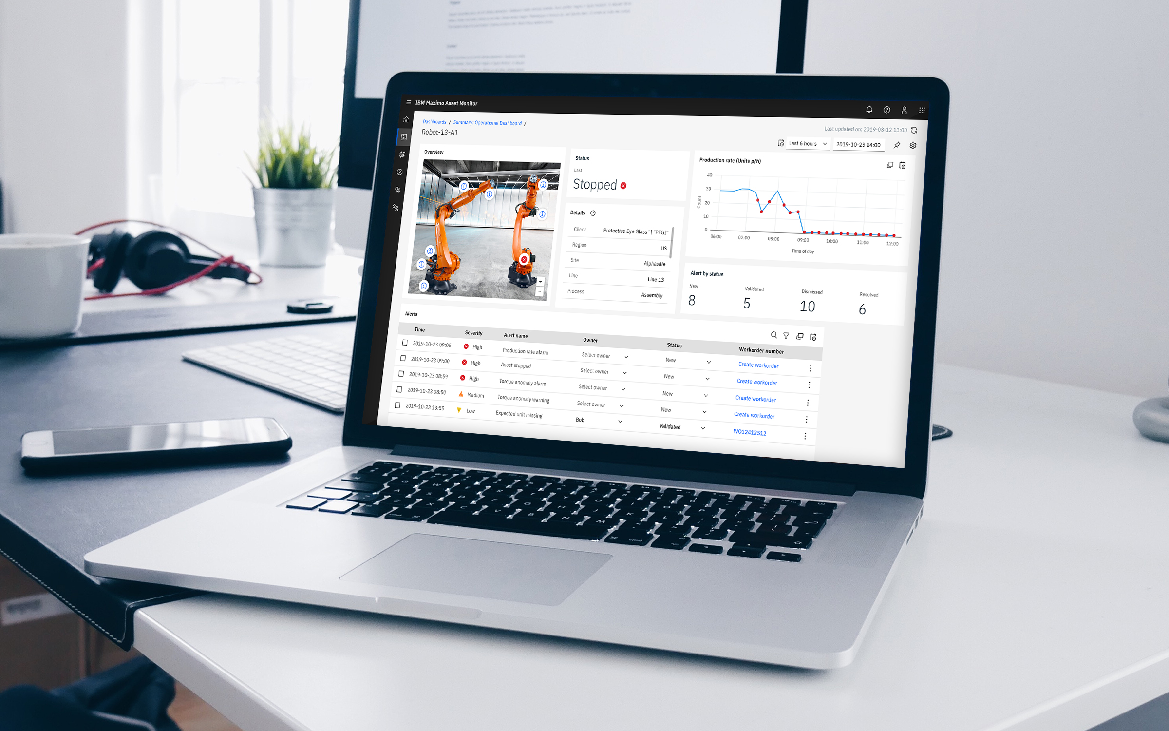
A small disruption of normal operational processes like a piece of broken machinery could translate to huge losses for a company. If problems arise, they need to be noticed as soon as possible and addressed quickly.
Keeping in mind that time is precious, how might we design dashboards that can:
- Convey complex data at a glance
- Highlight operational issues quickly
- Make it easy to resolve issues
Key personas

Oscar, the Application Administrator
Oscar works in an IT Organization and is responsible for administering the IoT solutions used by his line of businesses. He is installing, configuring, and maintaining solutions like Maximo Asset Monitor for the operations team.
Bryan, the Operator
Bryan is in a remote operations control center in an asset-intensive industry. He works shifts and is assigned to monitor one or more sites with control systems up to 100,000 data points each.
Ed, the Maintenance Supervisor
Ed is the supervisor that schedules maintenance tasks based on maintenance schedules, anomalies, or predictions of failure.
A bit more about the design process
My goal: Breaking down complex screens
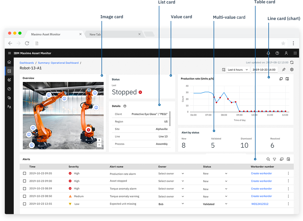
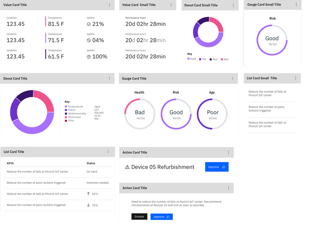
Each dashboard card would be based around a certain visualization--for example, a dashboard value card would have a large value or number as it's focus. Each card type would have it's own set of rules.
Inital brainstorm: Exploring visual designs and card sizes.
Maturing the dashboard design standards
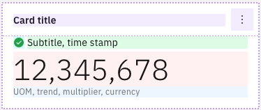
After doing some iterating and determining the different types of cards, it was time to standardize the basic card design. All dashboard cards would have the same basic anatomy: Title, Subtitle (optional), Actions, and Card body.
Cards can have fluid widths and fixed heights. Five different size options (xsmall, small, medium, large, xlarge) are available based on the amount of page columns the card spans. This allowed for great variation in card design to best fit the needs of the data.
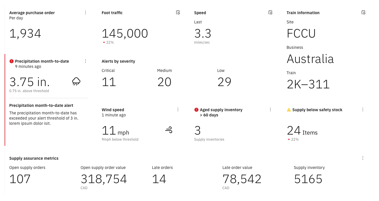
Examples of content that can appear in a value card.
Dashboard card interaction design
Although I've discussed a lot of visual work so far, Monitor dashboards are typically not meant to be static things. If there is an issue with an operational process, it needs to be easy to understand and resolve quickly.
We also designed and implemented card actions such as zoom and pan, hover and tooltip states, changing time ranges, and submitting service request. Check out the video below to see some of these interactions.